We Listened to Feedback
When we release a product, we rely heavily on user feedback to determine what's working and what isn't. We take what we learn and do our best to respond to the needs of our users with updates that can move the product in the right direction.
Since the service launched, we've heard a lot from Syncr users about what's working and what needs improvement. There have been a few incremental updates over the last year and a half that addressed these needs, both under the hood and user-facing.
Clearer Interface, Cleaner Design
The first thing you'll notice when you visit the Syncr site is that it feels lighter. The content on the landing page has been rewritten to be much more understandable. Before, there was some confusion over exactly what Syncr is and what it does. Now, the content provides a much better idea. There are plans to continue improving the landing page in that direction by further clarifying and explaining the function of Syncr. In addition, the site has been given a bit of air by making better use of space and removing some unneeded containers.
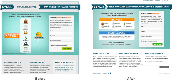
Better Direction
Something we were consistently were hearing from both customers and our own team was that the site and the service needed to be much clearer. There was a noted lack of understanding about how the product worked. We had already created plenty of content necessary to educate people about Syncr, but we had not done a thorough job of leading people to that information. Helpful documentation isn't very useful if people can't find it. In this latest update, the navigation has been refocused and made much clearer than ever before. No longer are there two levels of navigation (three if you count the footer), which made navigating the site and knowing where you were a chore. We've simplified the navigation, and we hope that this will alleviate a lot of the confusion and help people find what they need.
Now the Navigation is all in One Place

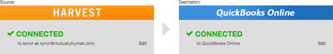
Easier Set-Up
In a previous update, we refined the setup process to make it a smoother and more customizable experience. We unified the process of setting up an account and added better support for controlling which types of data would and wouldn't be brought into QuickBooks. This was a helpful improvement, but it didn't get us all the way there. Users were still suffering from confusion about the direction of the data transfer. In this update, we straightened out the confusion by clearly labeling Harvest as the source of the data and QuickBooks Online as the destination. Now it's much more organized. We've also added more useful help text to inform users about the impact their decisions will have.
An improved settings screen clarifies that Syncr syncs from Harvest to Quickbooks Online.
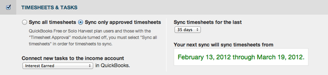
It's now easier to understand custom sync settings.
See For Yourself
There are a bunch more cool new updates and adjustments to the interface, you should head over to http://www.syncrhq.com to check them out. Let us know what you think!